Creating elevated, memorable visual branding
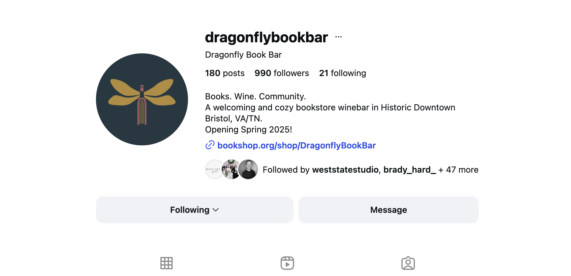
Dragonfly Book Bar (Bristol, VA)
When Rene and Sarah Beth, childhood best friends and the owners of Dragonfly Book Bar, reached out to me, they already knew who they were and who they were building this space for. Their vision was clear…it just hadn’t been translated visually yet. My role in this process is part designer, part guide, helping clients take what they know about their business and turn it into visuals that feel obvious in hindsight! Below, I’m walking you through how Rene and Sarah Beth’s vision came together visually, and why the process matters just as much as the final logo.
The Clarity Brief
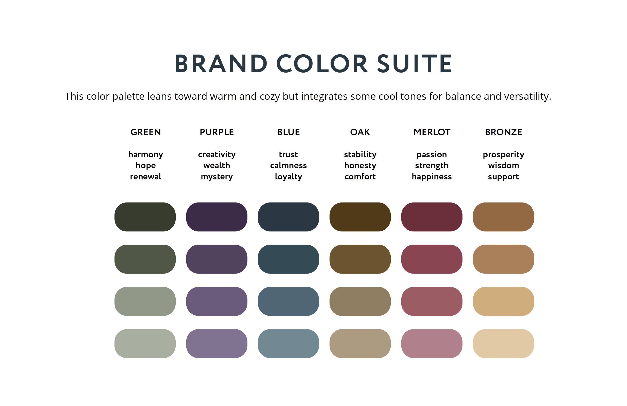
Before anything was designed, we slowed down and got clear. Through guided questions (both in person and through a questionnaire in their client portal), we defined what this brand needed to communicate and support, not just what it should look like.
Visual must-haves
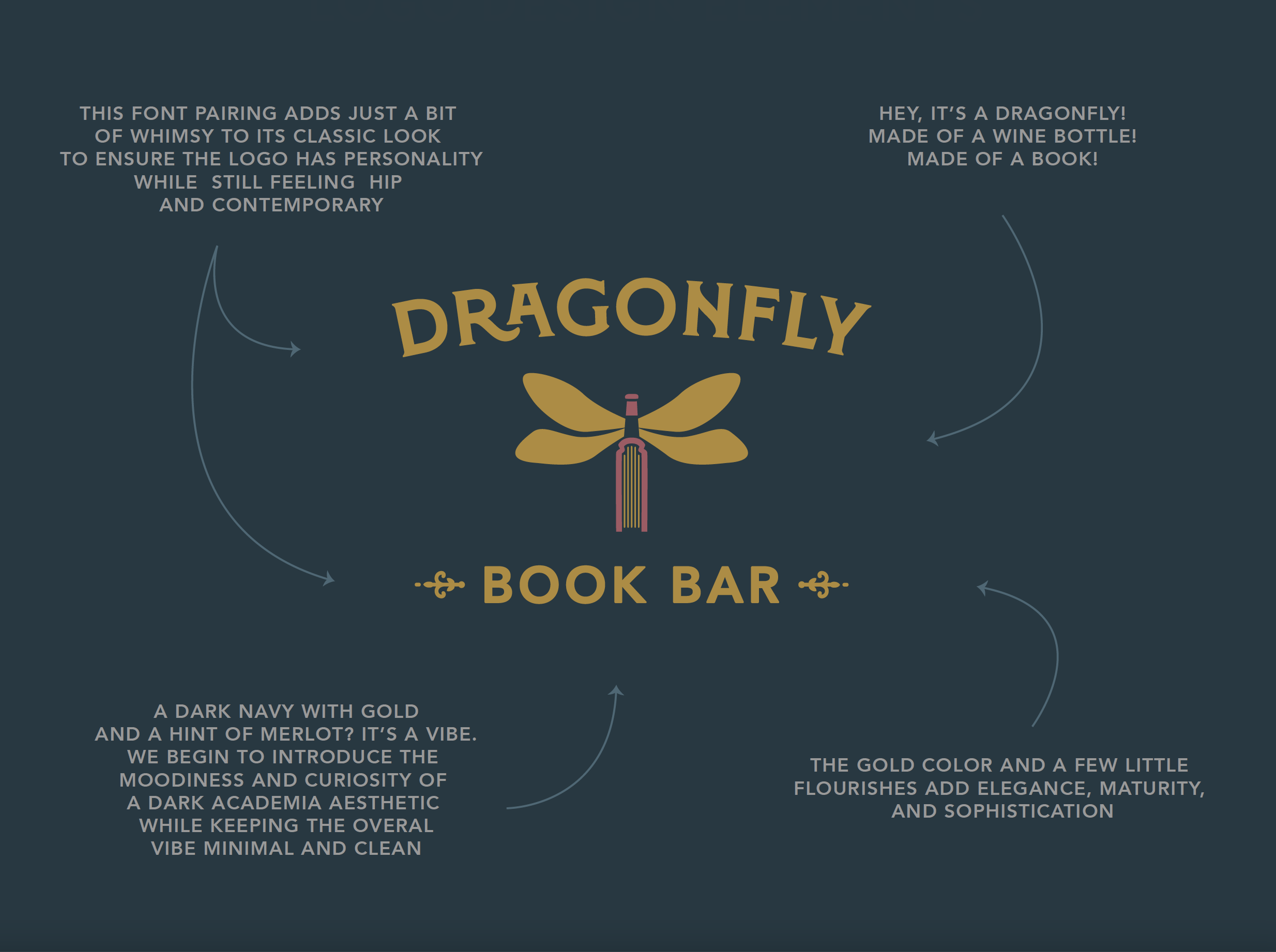
Dragonfly
Book
Wine
(Challenge happily accepted.)
The vibe
Academia-inspired
Eclectic
Hip
Unique
The balance
Serious, but a little playful
Sophisticated, but not stuffy
Comfortable, but engaging
The audience
Book lovers
Gift shoppers
Community seekers
This brief became our compass. Every design decision passed through it so the direction felt clear.
Finding the Direction
(not just a direction)
With three symbolic elements and a touch of whimsy, it would’ve been easy to go too literal, too playful, or too busy.
Instead, the goal was simplicity with depth: distilling the story into something confident, timeless, and flexible enough to live everywhere like signage, menus, merch, and digital spaces.
There are countless ways to combine a dragonfly, a book, and wine, but through this process, we naturally land on the one that feels like it was meant to belong all along. It’s not luck, it’s method: clarity always guides the design to a place that works.
The Reveal
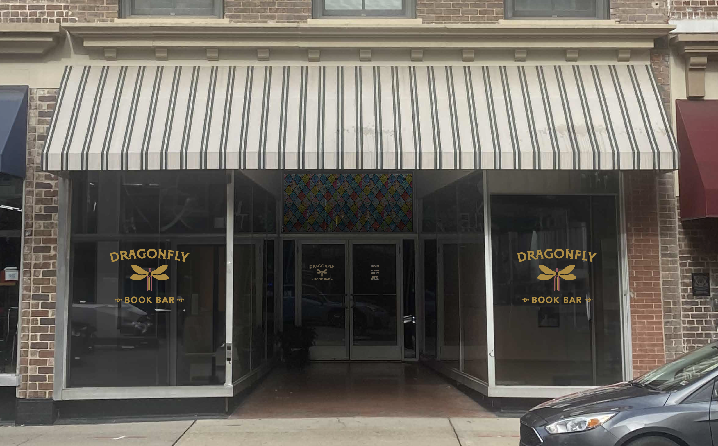
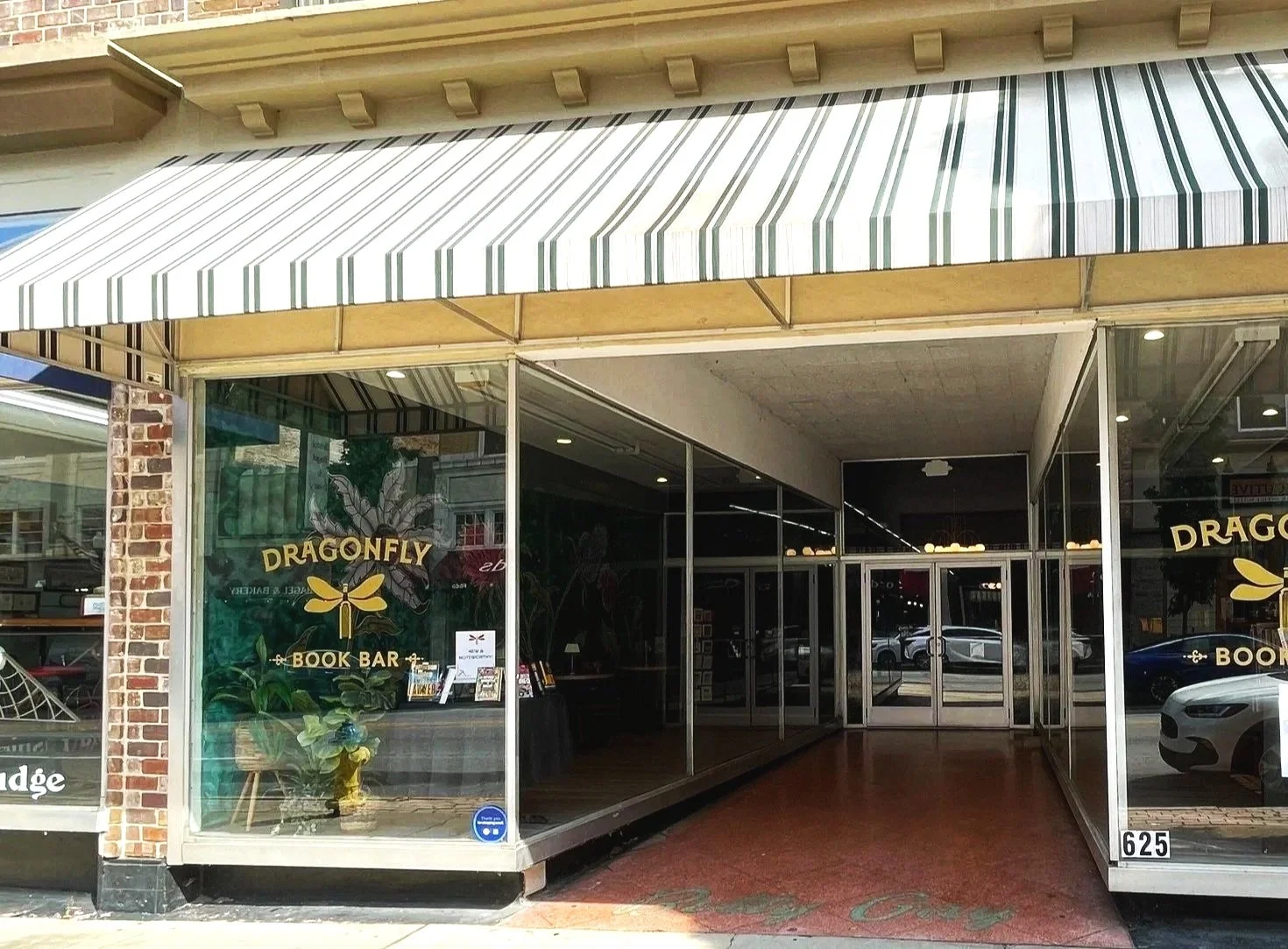
When it was time to present the logo, Rene and Sarah Beth weren’t given a stack of options to pick from. Instead, they saw the one logo that had been carefully developed from the Clarity Brief. And they didn’t just see it…they were walked through the thinking behind every element, with visuals on screen showing how it would look in the real world: on the storefront, merch, and other touchpoints. Taking the time to show it in context and explain the reasoning helps the vision click, makes decisions easy, and ensures the brand feels right from day one.
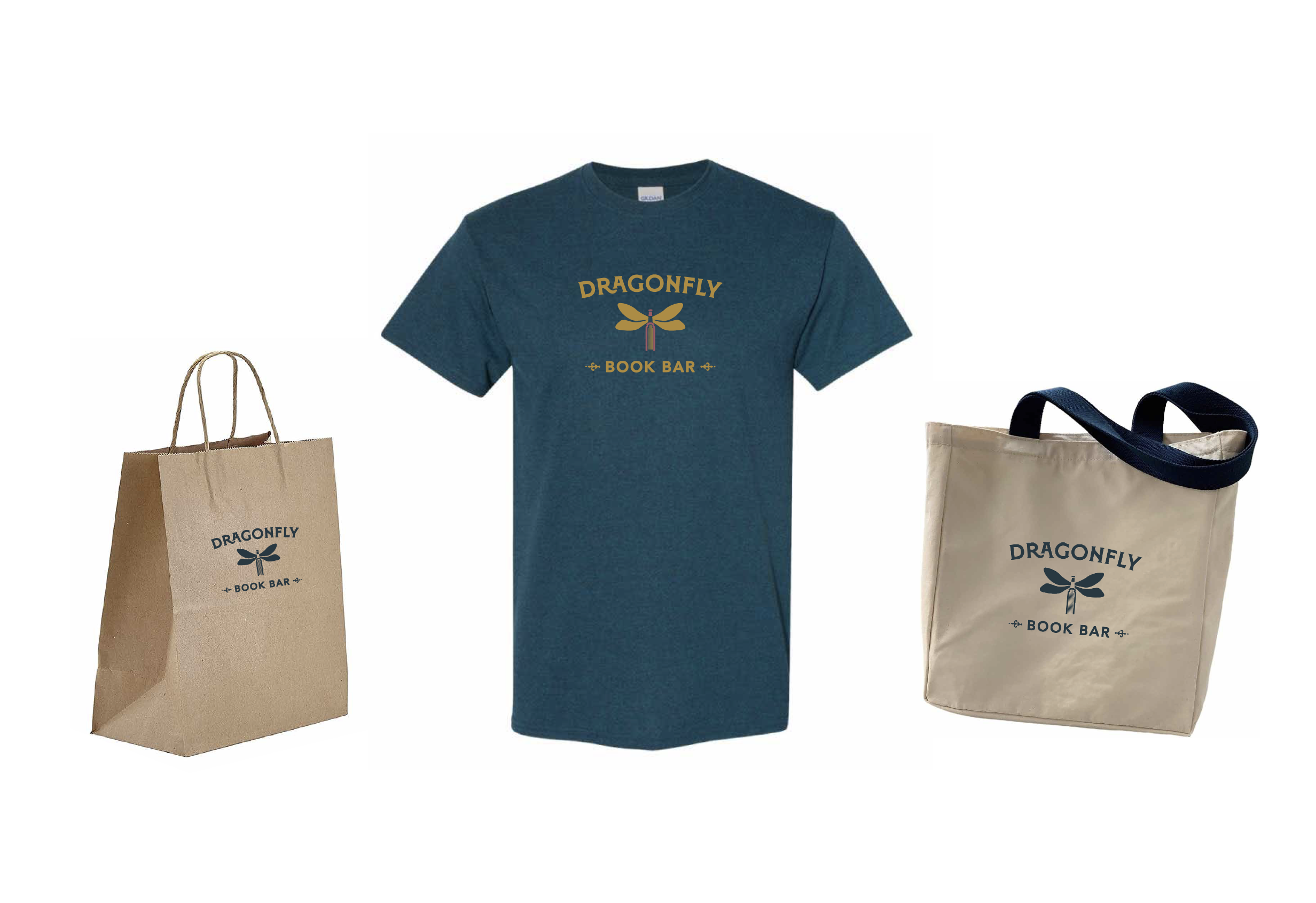
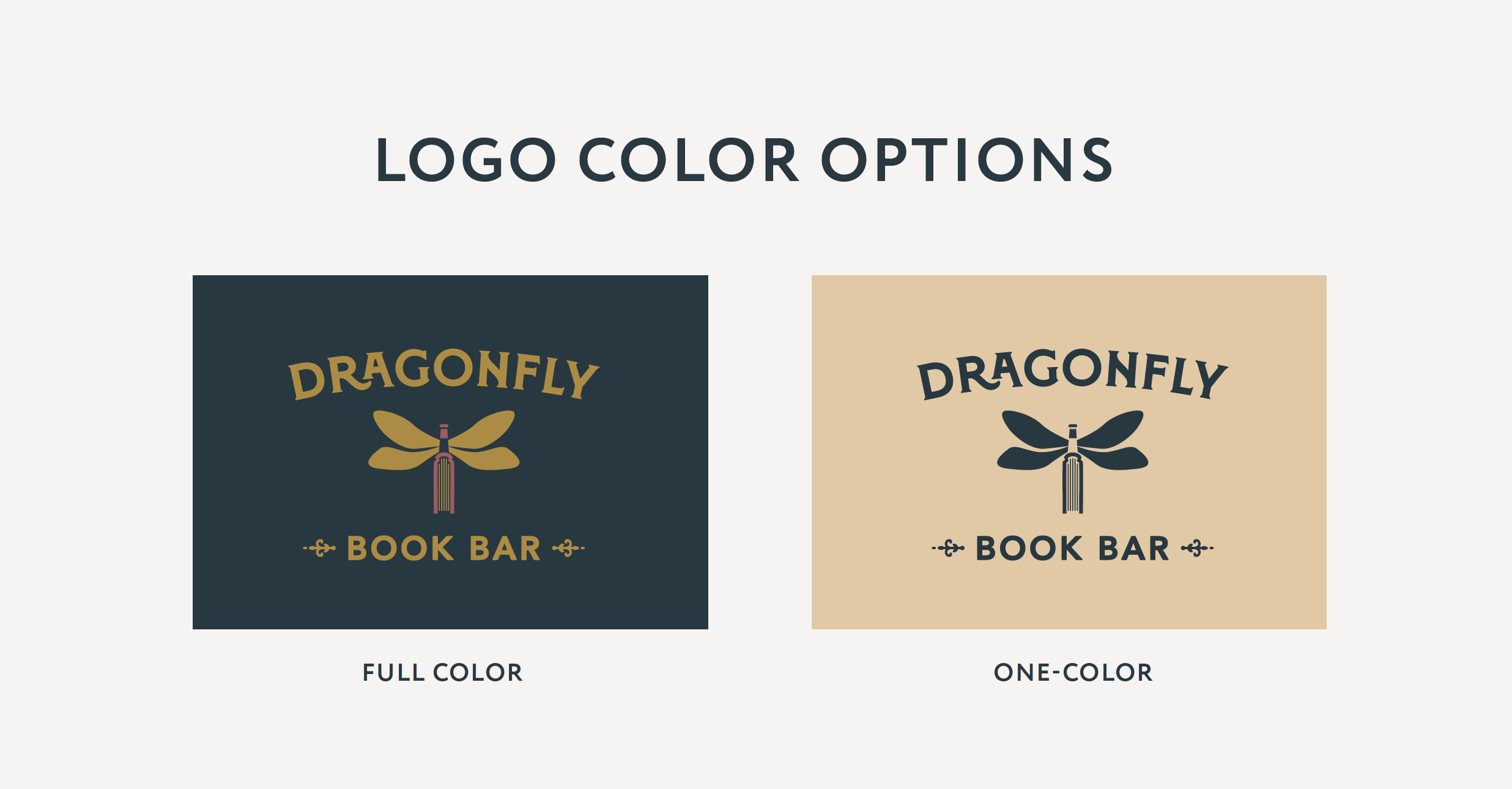
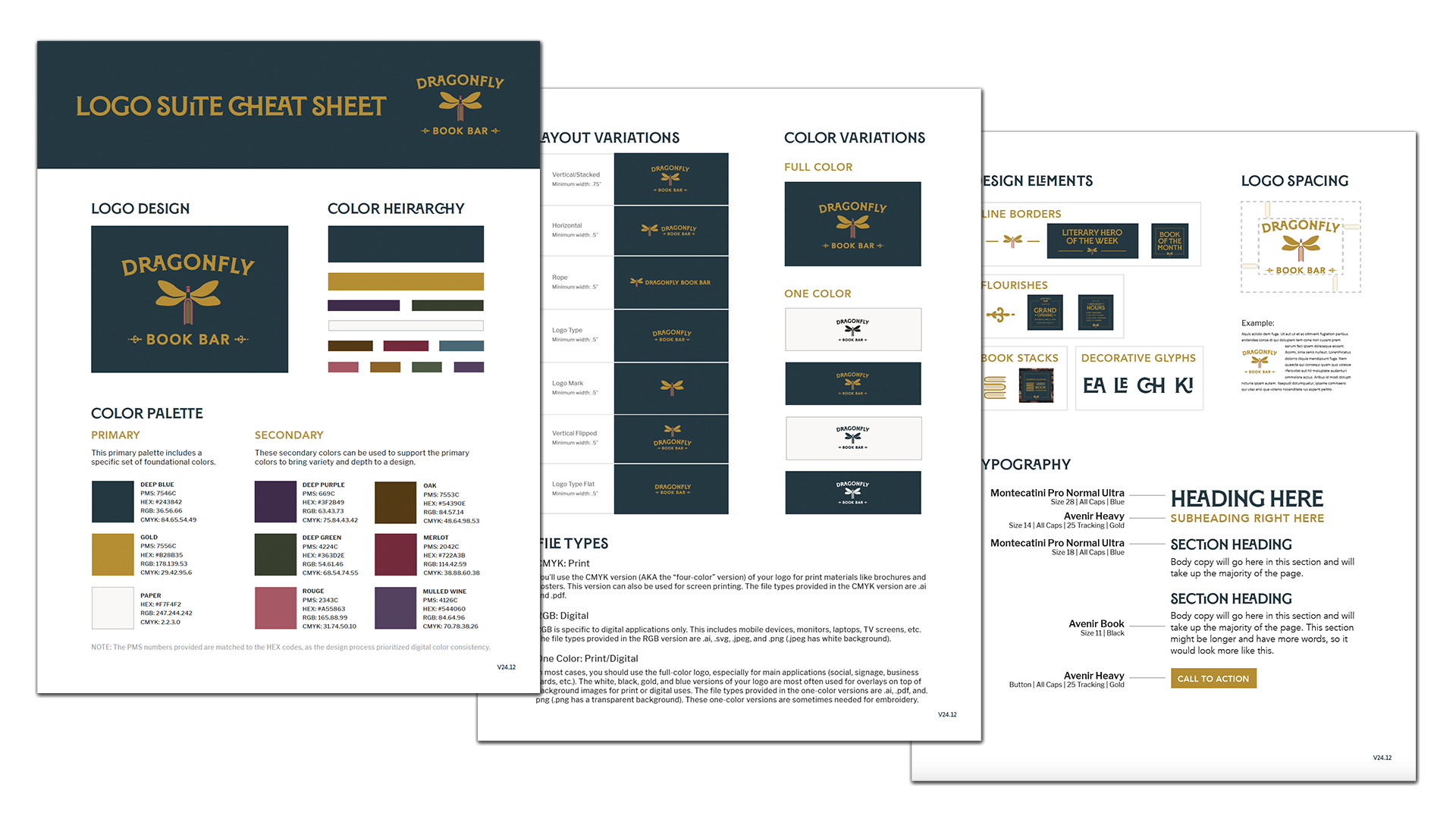
The Logo Suite Cheat Sheet
Once the design was approved, Rene and Sarah Beth received a full logo suite (all the files they will ever need…like, ever!) and a simple “cheat sheet” .pdf so they and anyone helping them later always know:
Which logo version to use
What colors work together
Which fonts belong to the brand
What files to send to vendors
This document makes it easy for them to actually use the visual brand identity across every touchpoint.
The Awards
The Dragonfly Book Bar logo went on to receive three American Advertising Awards (Northeast Tennessee, 2025), outperforming international agencies and large in-house teams:
Gold in Logo Design
Judge’s Choice
Best of Show
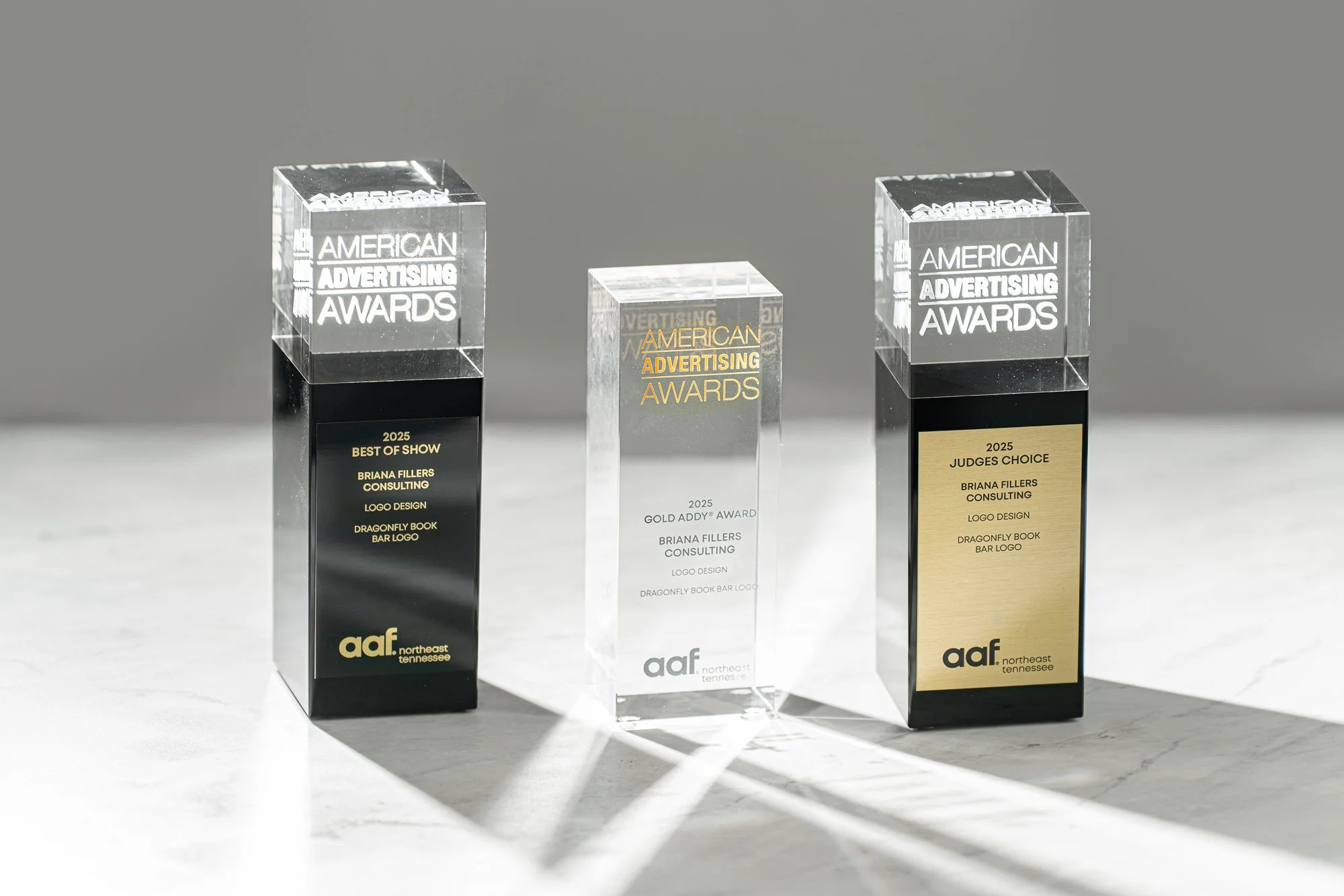
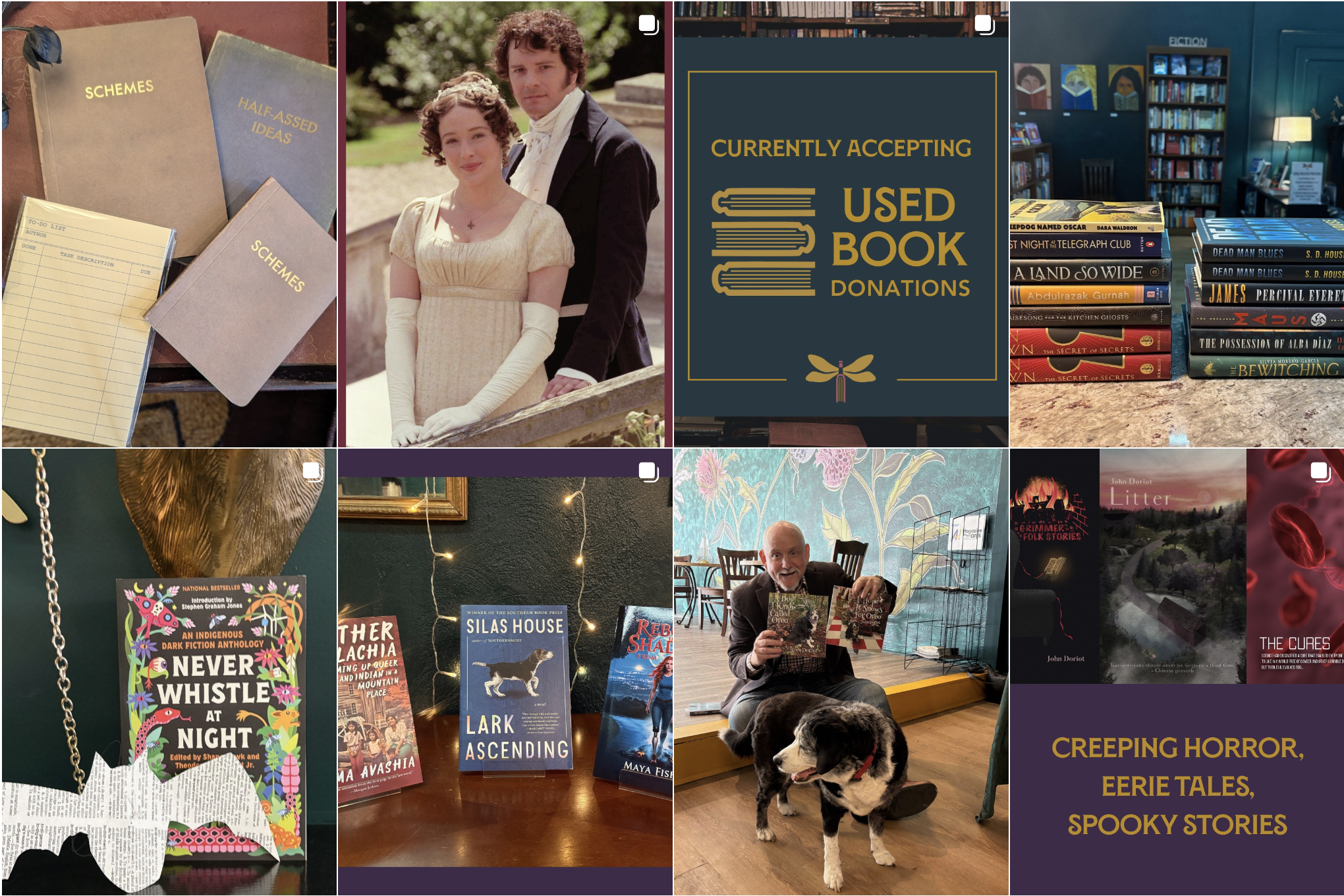
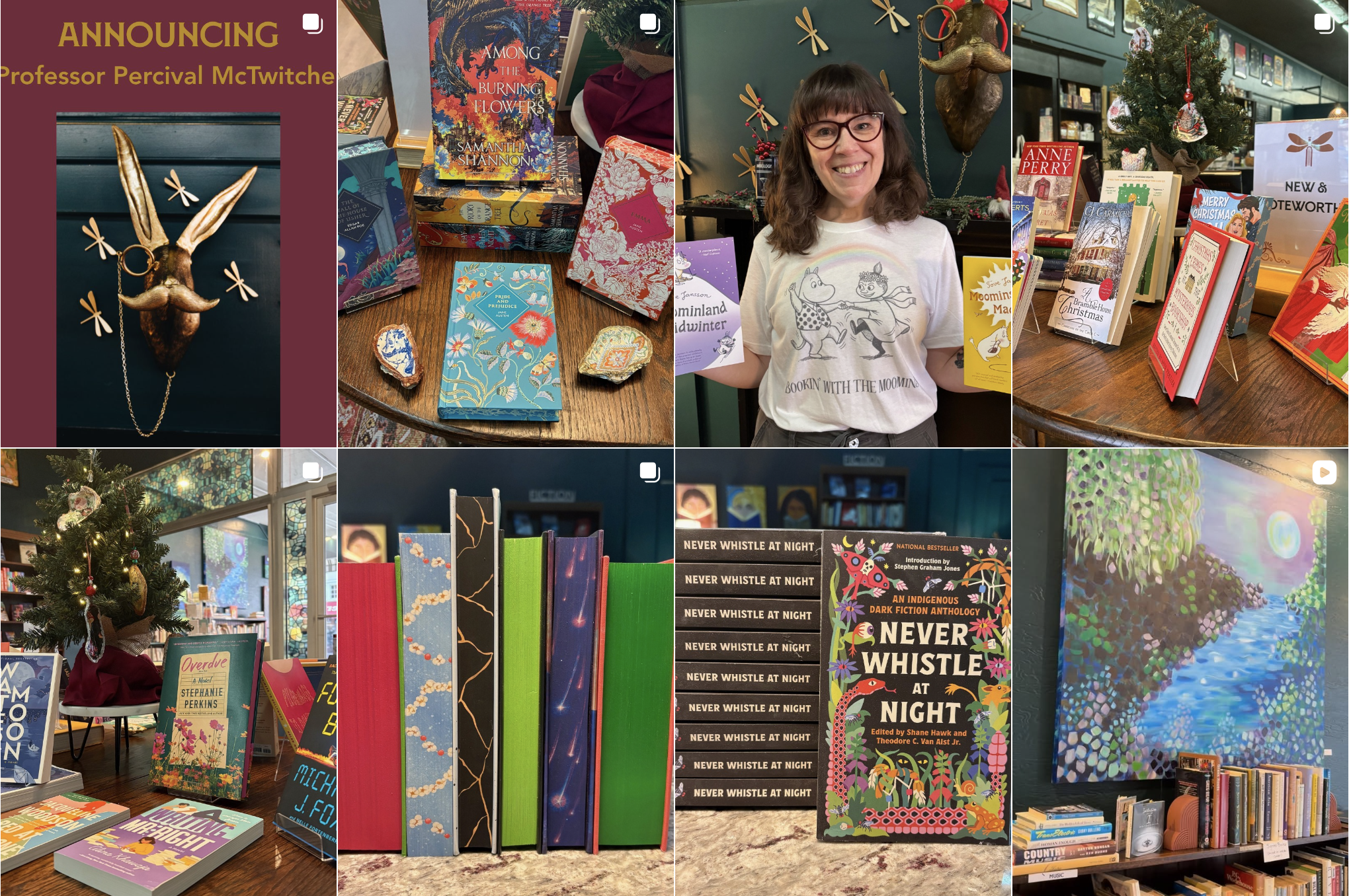
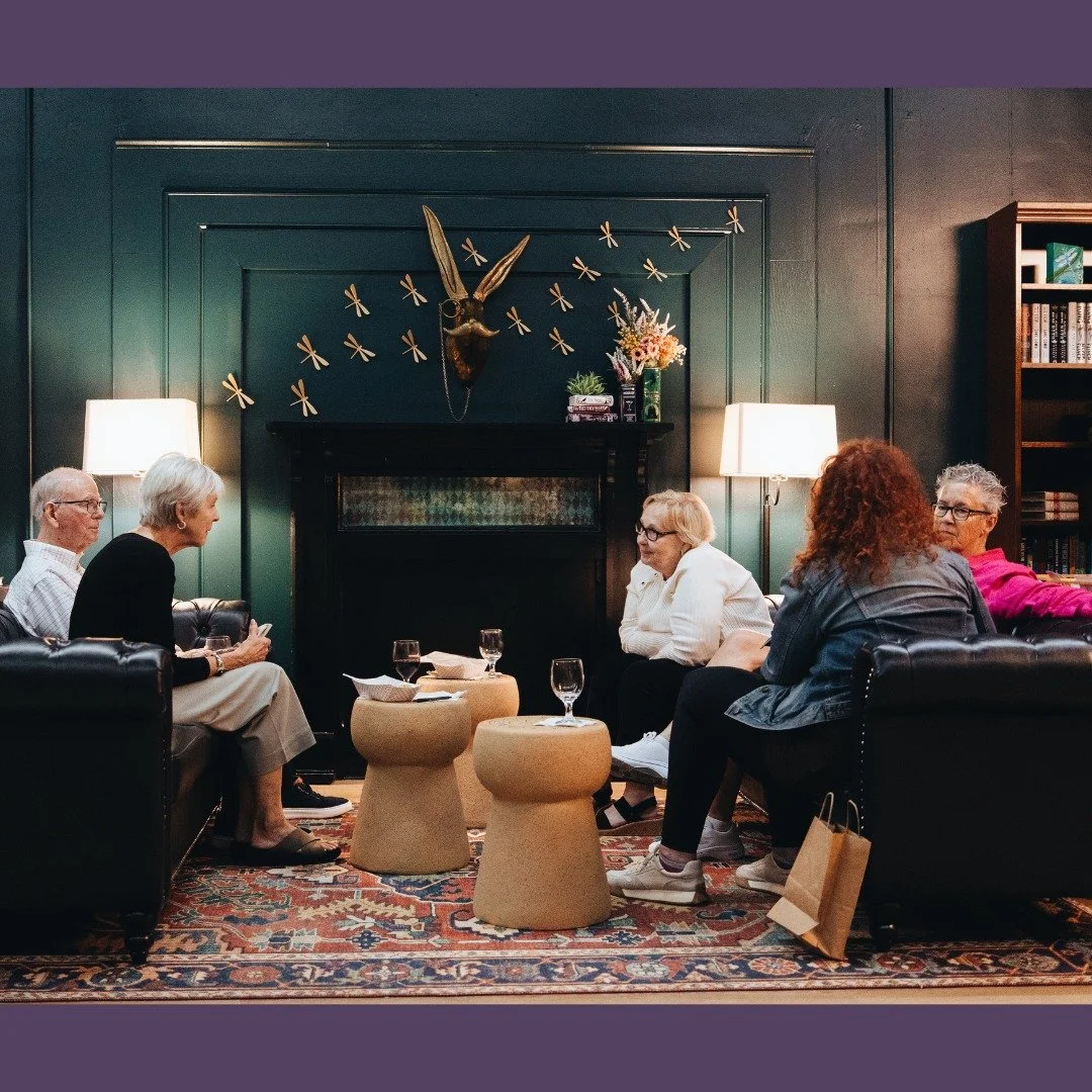
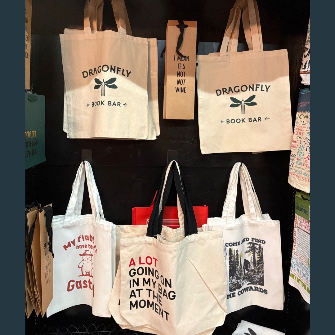
While our awards are wonderful validations of a successful, elevated logo design, the real success is seeing the logo as part of a bigger picture, living in the real world: supporting a local business that brings people together over books, wine, and community. Rene and Sarah Beth have done an incredible job carrying the visual brand forward, creating a consistent, welcoming experience both online and in person.
The Feedback
“The clarity questionnaire to collect our thoughts and vision at the beginning of the process was so useful; it was intended to help Briana, but it also helped us. We will use what came out of that questionnaire for our business and brand decisions down the line. It was great to have in-person and email contact with Briana for feedback during our project.
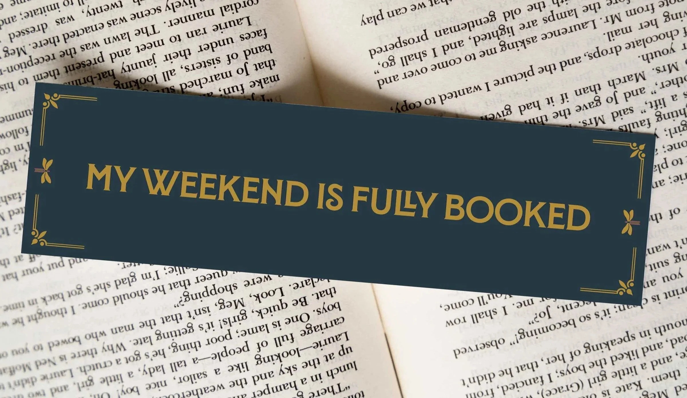
When she presented the logo, it was so helpful to see it as a mockup on our storefront and merch to give us a sense of what it would look like and its impact. We love our branding, and we’ve had lots of great feedback. Briana interpreted our vision into visual form, and we’ve seen the success of that transformation through the reactions we’ve received. On top of that, she fit our project in with a short timeframe, scaled her services to fit our stage of business, created amazing and useful Canva social media templates, and developed a bookmark/business card hybrid that is GREAT! You can see the clarity, simplicity, and depth of professional design in the work she delivered.
She captured what we had in mind, and then elevated it!”
— Rene Rodgers, Co-owner, Dragonfly Book Bar (Bristol, VA)
If you know your business but feel unsure how it should look, this process is designed to get you there with confidence and fun along the way. Thoughtful branding happens when vision and strategy meet careful design, and when it’s done, it feels like it was always meant to look that way.