Stone Mountain Meats: A strategic brand positioned for explosive growth
Challenge
Stone Mountain Meats launched with a traditional butcher shop aesthetic in mind, but they realized their vision needed to be more unique and customer-focused to stand out in the market. They needed a comprehensive brand strategy to differentiate themselves.
Solution
I provided initial branding including:
brand strategy
messaging
visual identity design
photography
website development
These solutions helped align their brand with their target customers’ values and buying behaviors.


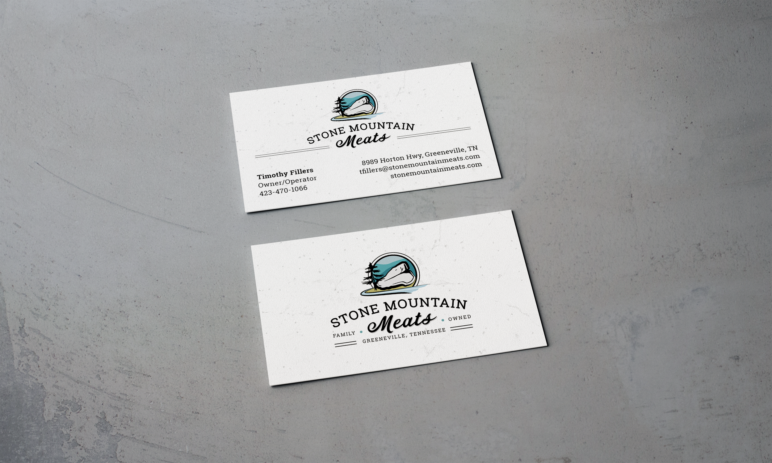
The font choice of Roboto Slab nods to “modern technology” with mechanical, geometric letter forms and natural, friendly curves.

The font choice of Corner Store JF nods to "traditional values" as a nostalgic script font that mimics hand-lettering seen on old-fashioned storefront signage.
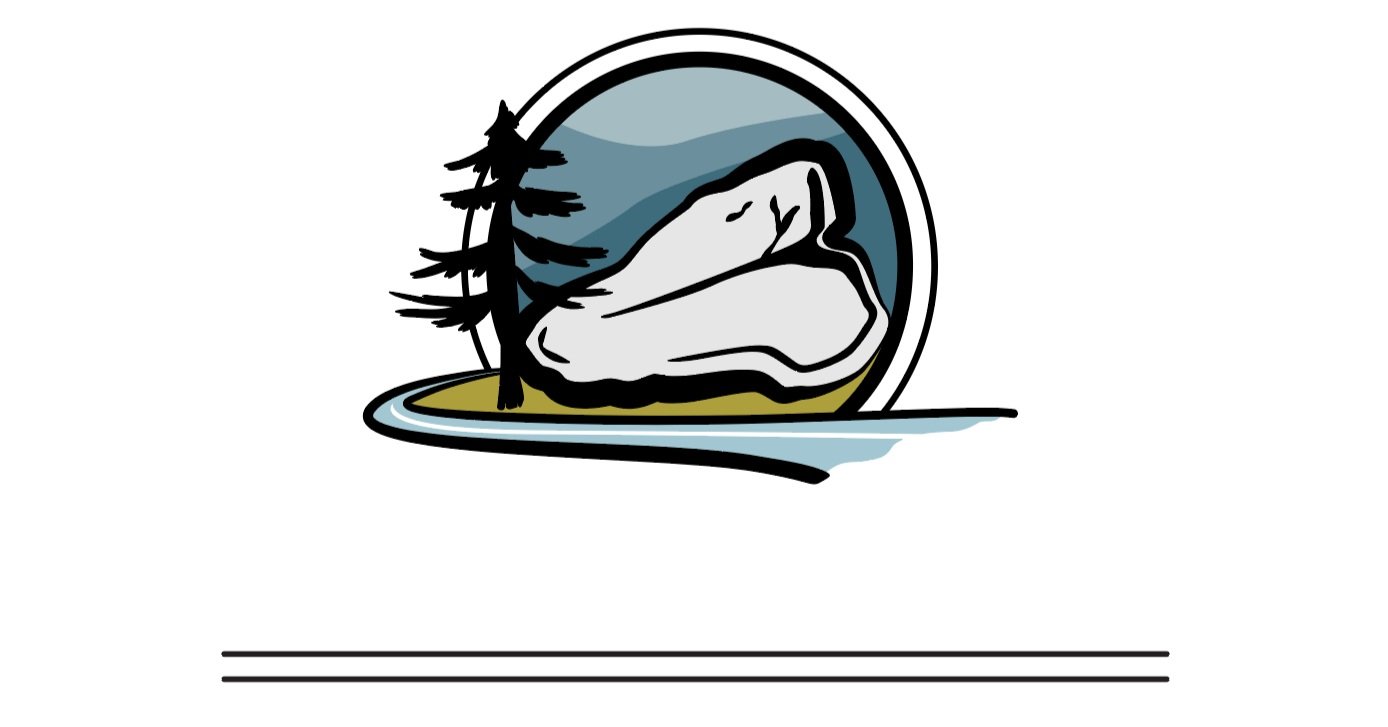
A landscape represents a thriving community, a core value of their brand. The lined circle helps to simplify and modernize a more detailed and traditional landscape. The straight lines offer balance at the bottom, as they tie in with the lined circle.

The main focus is this element... The light gray color suggests it’s a stone mountain, but the shape and markings suggest it’s a T-bone steak. The steak represents their other core value of quality meats.

To really drive home the fact that the steak is also meant to appear as a stone mountain, the tree, grass, and creek (based on actual visuals from the property) were added as visual accompaniment, along with mountains in the background.

It was important for me to note the location and that the business is family owned to provide context and add another layer of trust building.
Color is so important to design, so each color is meticulously chosen with intention, and you can get an idea of why I chose each color below.

Green is associated with nature and symbolizes freshness with an added warmth to this shade that is emotionally positive.

Blue is the preferred color of both genders, symbolizes trust, and provides another nod to nature (sky and water).

Light gray is the color associated most with stone. It symbolizes reliability and stability.

Black brings sophistication, professionalism, and seriousness to the design.
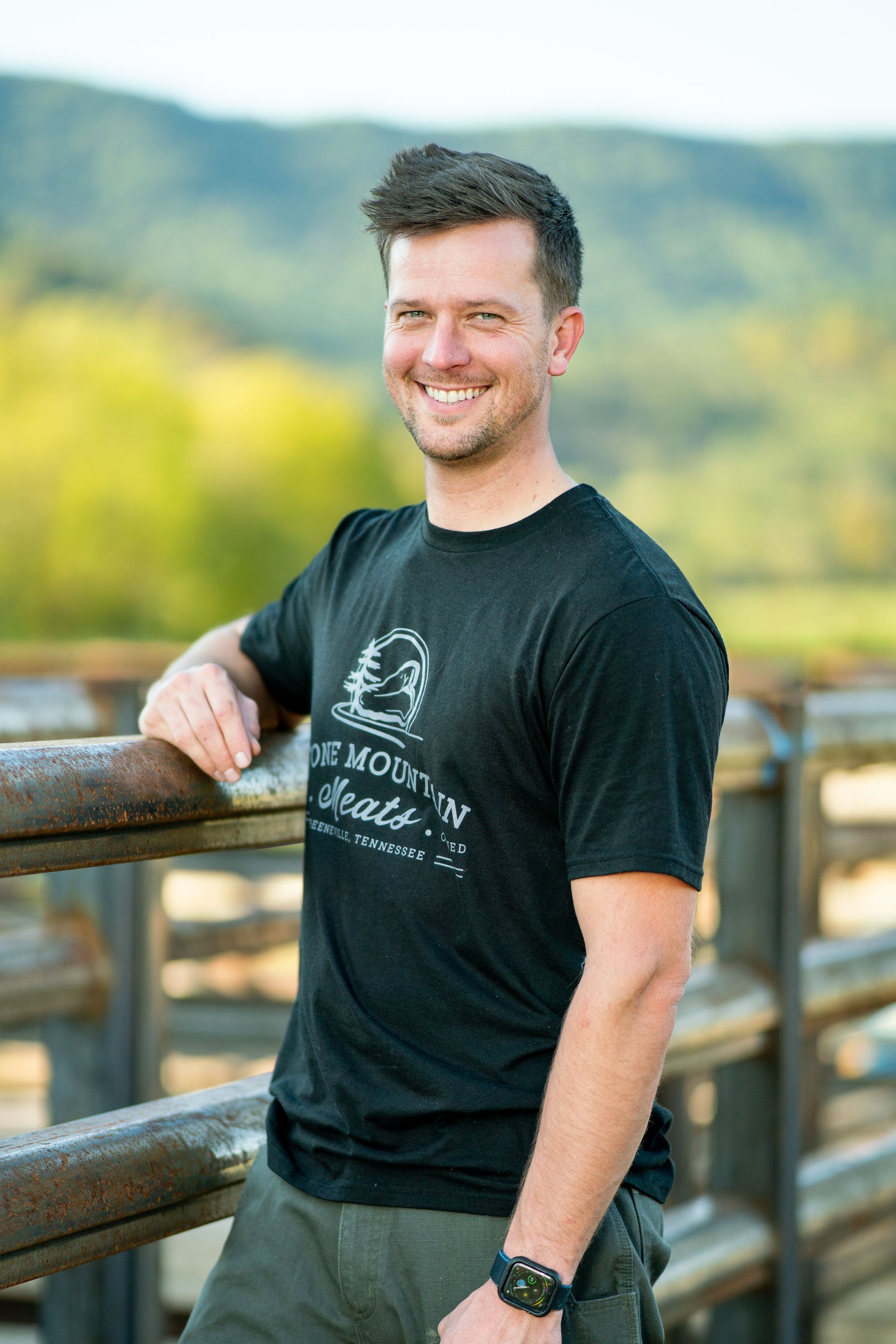
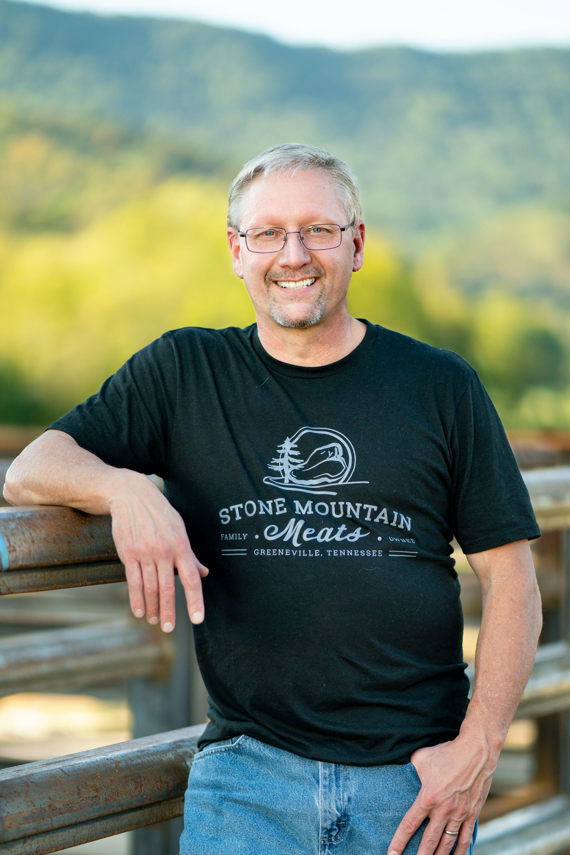
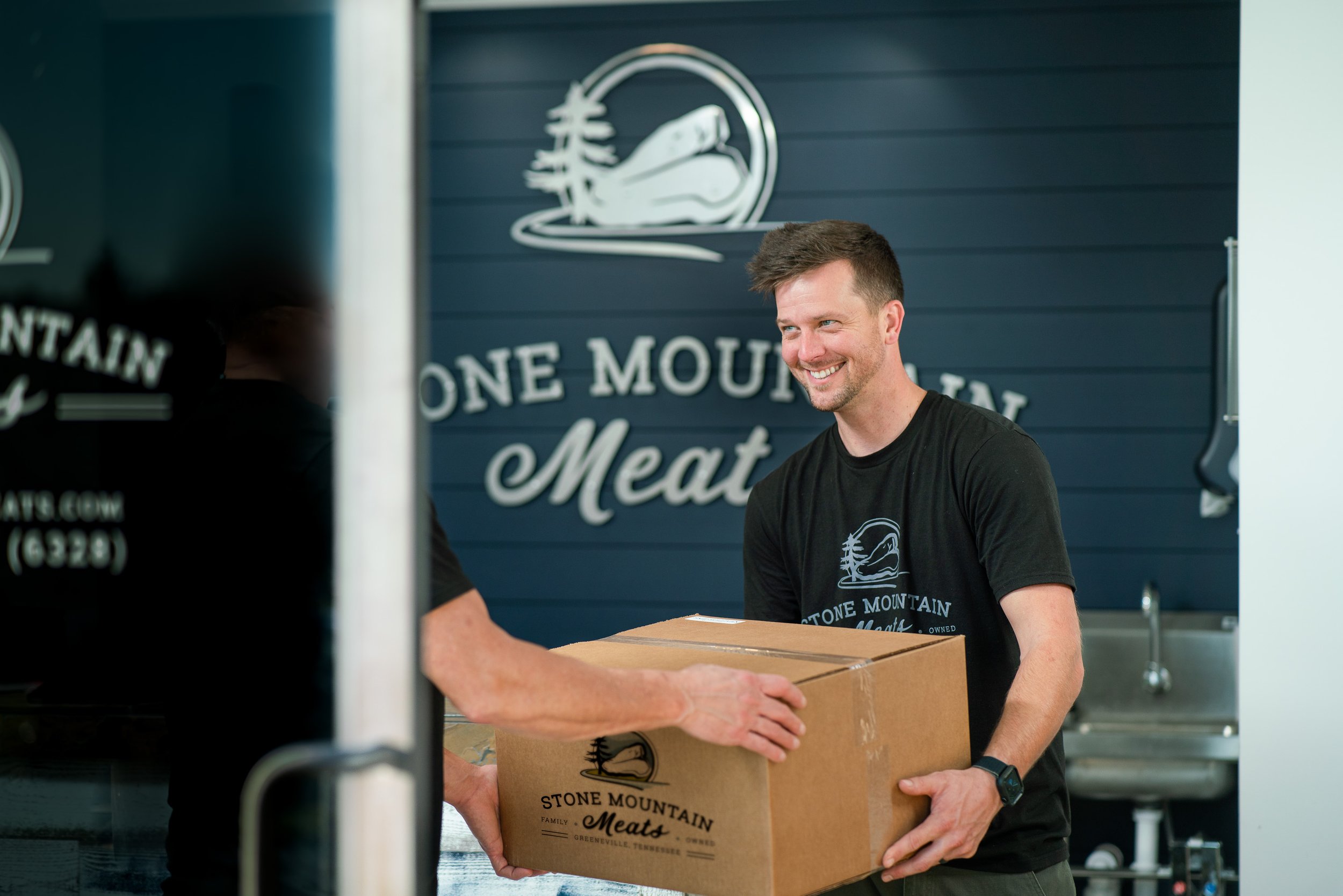
I always advocate for brands to include photography from the get-go because it really does add another level of trust and authenticity that can’t be replicated without seeing the faces behind the company. I was able to use their brand strategy to inform the style, colors, and shot list for the photography needed to establish them as a legit business.


Oftentimes, branding really feels real once it’s all combined onto a website. Since I knew the brand so well and had been involved since inception, I was able to build the site and supply nearly all of the written and visual content, making the entire branding process from start to finish extremely hands-off for the business owners.

I worked with Branded to have some t-shirts made for promotional items and staff uniforms.

I designed and ordered vinyl sign for the front door so passersby would know what was in that new building on Horton Highway. They also had a hookup for a really cool focal wall with a stand-off metal sign in the lobby.

Results
Positioned the brand for long-term success
Built a customer-focused strategy for visual identity and messaging
Enabled rapid growth through an instantly recognizable, differentiated brand
Testimonial
“Before talking with Briana, I thought I knew what I wanted our logo to look like: a distressed butcher shop logo with crossed knives or a butchers cleaver with a beef head. After she asked us questions about our vision for our business and our target audience, I definitely see how important that process is in determining branding decisions. It totally changed the direction of the logo design and really all of our marketing. The messaging, logo, photography, and website have all allowed us to stand out in our industry and connect to the customers we always hoped to have. She took care of it all after our initial conversations; we could focus on our business while she focused on our brand. Our branding has taken our business to another level.”
Does your business need a level-up like Stone Mountain Meats?
I’d love to hear about your vision and where you’re currently at in the branding process. Let’s hop on a quick call to chat! Want to learn more about the branding process they went through first? Cool, just click the button below.